Turn Your E-Commerce Spreadsheet Into an AI Dashboard with Google Sheets Canvas
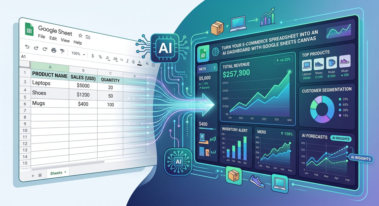
Your spreadsheet already has the data. Now turn it into something you can actually manage your business with.
Most e-commerce businesses have spreadsheets everywhere.
Sales reports.
Advertising reports.
Inventory sheets.
Product costs.
Marketplace fees.
Returns.
Monthly performance.
The information exists.
But opening a spreadsheet with 2,000 rows doesn’t immediately tell you:
What needs my attention today?
That’s where Google’s new Sheets Canvas becomes interesting.
Instead of treating your spreadsheet as rows and columns, you can use AI to turn the information into an interactive visual experience — a dashboard, tracker, management interface or lightweight business app — without building traditional software from scratch.
In this Practical Workshop (Day 3 of the series) we’re going to take the e-commerce profitability spreadsheet from our previous workshop and turn it into an AI-powered management dashboard.
Let’s build it.
Step 1: Start With the Business Question
Don’t begin with:
“Make my spreadsheet look nice.”
Start with:
“What decisions do I want this dashboard to help me make?”
For an e-commerce business, I would start with five:
1. Are we making money?
2. Which products are driving profit?
3. Which channels are performing best?
4. What problems need attention?
5. Where is the next growth opportunity?
Those questions should determine what appears on your dashboard.
Not the other way around.
Step 2: Prepare Your E-Commerce Data
AI can build an impressive-looking dashboard from bad data.
Unfortunately, it will still be a bad dashboard.
Before using Sheets Canvas, make sure your spreadsheet has a consistent structure.
A useful master sheet might contain:
| Field | Example |
|---|---|
| Month | August 2026 |
| Channel | Shopify |
| SKU | CM-100 |
| Product | Compact Coffee Machine |
| Units Sold | 84 |
| Revenue | $18,400 |
| COGS | $8,100 |
| Marketplace Fees | $0 |
| Payment Fees | $520 |
| Advertising | $2,100 |
| Shipping | $1,300 |
| Fulfilment | $620 |
| Returns | $440 |
| Contribution Profit | $5,320 |
| Contribution Margin | 28.9% |
| ROAS | 8.76 |
| Inventory | 126 |
If you sell across Shopify, Amazon, Walmart, Best Buy or other channels, keep the same structure for every channel.
Consistency is what makes the data useful.
Step 3: Add the Calculations Before Adding AI
Don’t ask AI to magically figure out your business economics every time.
Put the important formulas into the spreadsheet.
For example:
Contribution Profit
Revenue
− COGS
− Marketplace Fees
− Payment Fees
− Advertising
− Shipping
− Fulfilment
− Returns
Then:
Contribution Margin = Contribution Profit ÷ Revenue
And:
ROAS = Revenue ÷ Advertising Spend
You might also calculate:
Return Rate
Average Order Value
Inventory Weeks
Month-over-Month Growth
The spreadsheet should remain your calculation layer.
Think of Sheets Canvas as the visual and interaction layer sitting above it.
That’s an important distinction.
Step 4: Open Sheets Canvas
Now we get to the interesting part.
Open your spreadsheet and use the available Canvas experience in Google Sheets.
Instead of manually creating every chart, card and filter, describe what you want the AI to build from your spreadsheet data.
For example:
“Create an executive e-commerce profitability dashboard using this spreadsheet. Show total revenue, contribution profit, contribution margin, advertising spend and ROAS at the top. Add channel performance, top products, low-margin products, inventory risks and month-over-month performance. Make the dashboard easy for a business owner to understand.”
This is essentially vibe coding with your spreadsheet data.
You’re describing the business interface you want.
AI helps build it.
Step 5: Build Your Executive Scorecard
At the top of the dashboard, keep things simple.
I would start with six numbers:
Total Revenue
Contribution Profit
Contribution Margin
Orders
Advertising Spend
ROAS
Then add comparison indicators:
vs Last Month
and, where useful:
vs Last Year
Imagine opening your dashboard and seeing:
Revenue: $124,500 ↑ 12.4%
Contribution Profit: $21,800 ↑ 6.1%
Contribution Margin: 17.5% ↓ 1.0 percentage point
Immediately, you know something important.
Sales grew faster than profit.
That’s a management question worth investigating.
Step 6: Create Your Channel Performance View
Next, ask Canvas to visualize performance by channel.
For example:
“Create a channel comparison showing revenue, contribution profit, contribution margin and advertising efficiency for Shopify, Amazon, Walmart and Best Buy.”
You might discover:
Amazon
Highest revenue.
Shopify
Highest contribution margin.
Walmart
Fastest month-over-month growth.
Best Buy
Highest average order value.
Now your question becomes:
What role should each channel play in our business?
Instead of assuming every marketplace should be managed the same way.
Step 7: Create the Most Important Comparison
Ask Canvas to create two views:
Top Products by Revenue
and
Top Products by Contribution Profit
Put them beside each other.
This may be one of the most valuable parts of the entire dashboard.
Why?
Because your best-selling product isn’t always your most profitable product.
Imagine:
Product A
Revenue: $35,000
Contribution: $2,900
Product B
Revenue: $21,000
Contribution: $5,600
Which one deserves more advertising?
Which one deserves more homepage exposure?
Which one should your sales team push?
Now you have a better question to investigate.
Step 8: Build a Management Alert Panel
This is where the dashboard starts becoming more than visualization.
Ask Canvas to create an Attention Required section.
Define rules such as:
Contribution Margin below 10% → Margin Alert
Inventory below three weeks → Stock Risk
Return rate above target → Return Alert
ROAS falls significantly → Advertising Review
High conversion + low traffic → Growth Opportunity
High revenue + low contribution → Profitability Review
Your dashboard could show:
Attention Required
Product A: Margin Alert
Contribution margin fell from 17% to 9%.
Product B: Inventory Risk
Approximately 1.8 weeks of inventory remaining.
Product C: Growth Opportunity
Strong conversion and margin but traffic is 26% below category average.
This is much more useful than staring at hundreds of spreadsheet rows.
Step 9: Add Filters
Now make the dashboard interactive.
Useful filters could include:
Month
Channel
Product
Product Category
Brand
Marketplace
Profitability Status
Imagine selecting:
Channel → Walmart
and instantly seeing only:
Revenue.
Profitability.
Top products.
Advertising.
Inventory risks.
Or select:
Brand → Brand A
and see how that brand performs across Shopify and multiple marketplaces.
This turns your spreadsheet into a management tool.
Step 10: Create a Product Detail View
Your executive dashboard tells you where the problem is.
Now create another view that helps investigate it.
Ask Canvas:
“Create a product detail view. When a product is selected, show revenue, units, contribution profit, margin, advertising, ROAS, return rate, inventory and performance by channel.”
Now imagine selecting Product A.
You discover:
Shopify margin: 27%
Amazon margin: 13%
Walmart margin: 18%
Same product.
Different economics.
That’s actionable information.
Step 11: Create a Monthly Management View
Next, create a page specifically for your monthly meeting.
Include:
What Improved?
Top positive changes.
What Declined?
Largest negative changes.
What Needs Attention?
Margin, inventory, returns and advertising alerts.
Where Are the Opportunities?
High-margin products, strong conversion and emerging growth.
What Should We Do Next?
Your management priorities.
This gives you a dashboard that supports a conversation, not just a presentation.
Step 12: Add AI Analysis Above the Dashboard
Now we go one level further.
The dashboard tells you:
what happened.
AI can help investigate:
what might matter.
Ask:
“Analyze the current dashboard and identify the five most important changes that management should investigate. For each one, show the supporting data. Separate facts from hypotheses and do not assume causation where the data does not prove it.”
This is critical.
Suppose AI finds:
Product A revenue increased 31%, but contribution margin declined from 22% to 14%.
Good.
Then it might suggest investigating:
advertising costs
discounts
marketplace fees
shipping
product cost changes.
That’s useful.
What it should not say without evidence is:
“Customers became more price-sensitive.”
AI should help identify the question.
Your business data should determine the answer.
Step 13: Ask the Question Every Business Owner Actually Wants Answered
Once the dashboard works, try:
“What needs my attention?”
Imagine receiving:
1. Product A — Profitability Risk
Revenue increased 24%, but contribution margin declined six percentage points.
2. Product B — Inventory Risk
Current inventory represents approximately 1.6 weeks of sales.
3. Product C — Growth Opportunity
Conversion and margin are above average, but traffic remains low.
4. Amazon — Advertising Review
Ad spend increased faster than contribution profit.
5. Shopify — Positive Signal
Revenue and contribution both increased while margin remained stable.
Now AI isn’t merely reporting numbers.
It’s helping you decide where to look first.
Step 14: Create Different Views for Different People
One dashboard doesn’t need to show everyone everything.
Owner / Management
Revenue, profit, risks, opportunities.
Marketing
Traffic, conversion, advertising, ROAS, product performance.
E-Commerce Manager
Channel performance, listings, inventory, returns.
Operations
Orders, inventory, fulfilment and stock risks.
This is one of the advantages of turning spreadsheet data into a lightweight application.
People can focus on the information relevant to their decisions.
Step 15: Build the Monthly Workflow
Your process can now become:
Shopify + Marketplace Data
↓
Advertising Data
↓
Inventory + Cost Data
↓
Google Sheets
↓
Calculations
↓
Sheets Canvas Dashboard
↓
AI Analysis
↓
Human Review
↓
Monthly Action Plan
The dashboard becomes the interface.
AI becomes the analysis layer.
Humans remain the decision makers.
Bonus: Create a “Monday Morning” Dashboard
You don’t have to use this only once a month.
Create a simplified operational view called:
Monday Morning
Ask it to show only:
Sales change
Profitability change
Advertising problems
Inventory risks
Unusual returns
Products gaining momentum
Products losing momentum
The goal is simple:
What deserves my attention this week?
This is where AI dashboards can become genuinely useful.
Instead of managers spending Monday morning opening five marketplaces, three advertising platforms and several spreadsheets, they start with one management view.
Then they investigate the exceptions.
Don’t Automate Everything Yet
Once you see what’s possible, it’s tempting to connect every system immediately.
Don’t.
Start manually.
Export the reports.
Clean the data.
Build the calculations.
Test the dashboard.
Compare its conclusions with what you already know about the business.
Improve the logic.
Only then decide what should be automated.
A useful rule is:
Manual → Repeatable → Reliable → Automated
Not:
Messy → AI → Automated Mess.
The Dashboard Isn’t the Product. The Decision Is.
Google Sheets Canvas makes the visual part easier.
AI makes the analysis faster.
But neither replaces good business logic.
Your dashboard still needs accurate:
Sales
Costs
Fees
Advertising
Inventory
Returns
And management still needs to ask good questions.
The real opportunity isn’t turning a spreadsheet into something prettier.
It’s turning:
Data → Information → Insight → Decision → Action
That’s what an AI-powered e-commerce dashboard should do.
Because ultimately, you don’t need another chart.
You need to know what to do next.
Not Sure Where to Start?
If your e-commerce data is spread across Shopify, marketplaces, advertising platforms and spreadsheets and you’re not sure how to turn it into a useful management system? NorthPilot Digital Agency can help.
We can help structure your e-commerce data, define the metrics that matter, build profitability and channel reporting, and explore practical AI-powered dashboards and workflows designed around the decisions your business actually needs to make.
Contact NorthPilot and let’s turn your e-commerce data into a management system you can actually use.